Imagine the following scenario: you have a list of objectives you want to show in the game HUD. Sounds simple enough to implement in Unity’s built-in UI system, right? Just throw a HorizontalLayoutGroup on a panel, insert your elements, and the panel will automatically size to fit. Instantiate new children as new objectives come in.
However, when you add new objectives, it doesn’t look especially nice to have the UI expand immediately. Plus, you want to draw the player’s attention to the objectives list when it is updated. So, you decide to animate the objectives list.
Using Unity’s built-in UI components, this turns out to be a bit difficult to do. There is no built-in support for animation in the UI system. How, then, do we go about animating this list?
One way to do it is to simply throw away Unity’s layout engine altogether, and only use their components for display/events. This is a perfectly valid way to go about it, and in fact is necessary if you want more control over how the animation is done. However, one of my main goals was to leverage Unity’s layout engine somehow.
Another way is to follow the technique laid out in this answer. In summary, they create a hidden hierarchy for layout, and the “real” UI interpolates to the match the size of the hidden hierarchy over time. This sounds like a reasonable approach, but seems a little clunky to me in terms of setup.
Where, then, does that leave us?
- We want to insert elements directly into the
LayoutGroup, and for those elements to begin at no size. - But we still want Unity to tell us what size those elements should be, when they’re at full size.
There are a few tricks I used to pull this off. Most of it is contained within the way I’ve organized the hierarchy:
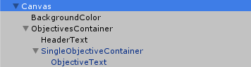
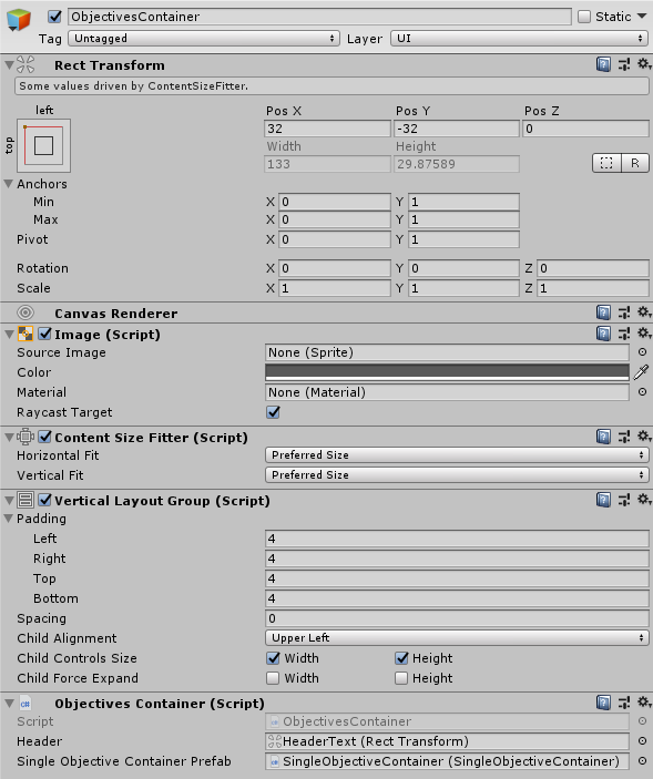
The parent, the ObjectivesContainer, has a VerticalLayoutGroup, along with a ContentSizeFitter so that it always snugly fits its children:
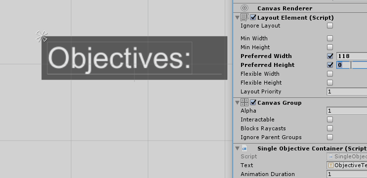
In a traditional VerticalLayoutGroup setup, we’d put the row content directly under ObjectivesContainer. However, you might have noticed that ObjectiveText is not in ObjectivesContainer; instead, it’s been placed under SingleObjectiveContainer. Here’s the inspector for SingleObjectiveContainer (on the left) and ObjectiveText (on the right):
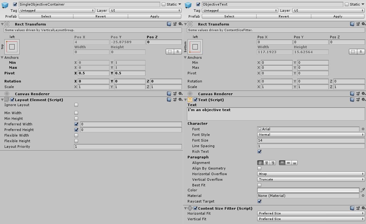
The important thing here is that the SingleObjectiveContainer has a LayoutElement component. This allows us to shrink the row without affecting the size of the content inside of the row, by modifying the preferredWidth and preferredHeight properties.
You might also note that there is a ContentSizeFitter on the content element, with both “Horizontal Fit” and “Vertical Fit” to “Preferred Size”. We could not do this without the container element, as Unity’s layout system must control the size of its direct children. We’ll discuss what we use this for later.
One last thing to call your attention to: the anchor of the ObjectiveText is set to the bottom-left. This is done so our text sticks to the bottom-side of the container, so that when we animate, the text appears to drop downwards. (Try playing around with the anchor after the effect is finished and you’ll see what I mean.)
With this configuration, we can now modify the values on the SingleObjectiveContainer’s LayoutGroup and have the ObjectivesContainer follow:
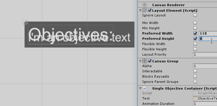
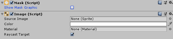
Obviously, row content showing behind other elements is undesirable. We can solve this by adding an Image component and a Mask component to the container. Make sure to uncheck “Show Mask Graphic”; the Image component is only there to define the mask boundaries, and shouldn’t be drawn.
With the mask, only the portion text that fits within the container is shown:
We now have all the tools we need to do the animation. For the insertion animation, we’ll animate the container from (0,0) to the size of the size of the inner content’s RectTransform. Since the content’s RectTransform is being controlled by a ContentSizeFitter, that means we’ll animate to the exact size needed to fit the inner content snugly.
Note that the ContentSizeFitter isn’t special; you could set the width and height of the content in other ways, such as by using an AspectRatioFitter, and this technique will work just as well. The important part is simply that we’re using the inner content’s size as the animation target, so it should be set to something reasonable.
I’ve done the animation using a Coroutine in code (though I’m sure there’s better ways to do it):
IEnumerator ShowSelf(float duration)
{
    float startHeight = rectTransform.rect.height;
    float endHeight = text.rectTransform.rect.height;
    float startWidth = rectTransform.rect.width;
    float endWidth = text.rectTransform.rect.width;

    float time = 0.0f;
    while (time < duration)
    {
        // Adding easing to the animation makes the animation much more fluid, compared to
        // a standard linear interpolation; see the repository below for the implementation
        layoutElement.preferredHeight = Util.EaseInOut(startHeight, endHeight, time, duration);
        layoutElement.preferredWidth = Util.EaseInOut(startWidth, endWidth, time, duration);

        yield return null;
        time += Time.deltaTime;
    }

    layoutElement.preferredHeight = endHeight;
    layoutElement.preferredWidth = endWidth;
}
A hiding animation is similar - all you need to do is reverse the start and end parameters.
After adding code for instantiating some prefabs, the result is what you see here:

Looking at it closely, there’s still room for improvement. The width of the rows appears to animate more quickly than the height, since we’re animating to 0 and not the edge of the container. This turns out to be a bit tricky to solve since the edge of the container could change in the middle of the animation. Still, this is good enough for something like the objectives list described above, since the user’s eyes won’t be focusing on it most of the time.
Here is a git repository containing a demonstration Unity project. This is what I used to create the final result gif above. There’s a few things in there I didn’t demonstrate explicitly in this post, such as updates and removals.
Here is the RTS that I made the effect for.