This is the first in a series of posts in which I’ll be breaking down some techniques we used to put together Rift Core. If you aren’t familiar with Rift Core, you can check it out here. It’s an action RTS game about a squad of mechs who are desperately trying to save their world.
In this post, I’ll be covering the general setup we used to achieve the look of the game. That means we’ll be talking about things like lights, cameras, and postprocessing effects.
I will preface this article by warning you that I am a programmer, not an artist. This article is designed primarily as documentation for my future self. However, it may also be useful to those who, like me, are somewhat new to this whole 3D style business.
Here are the most interesting things that contribute to the look of the game:
- Perspective camera with extremely low FOV
- Heavy reliance on postprocessing effects, especially ambient occlusion
- Three lights - one main directional light, one highlight light, and one center point light
We also used geoemetry with low polygon count. While this does contribute to the style, it’s covered extensively elsewhere, I won’t go into detail about it.
Images below show the “before” view, and you can hover most of them to see the “after” view.
Perspective, low-FOV camera
All cameras in Rift Core have their FOV set to 10. This nearly makes the camera into an orthographic camera - but not quite.
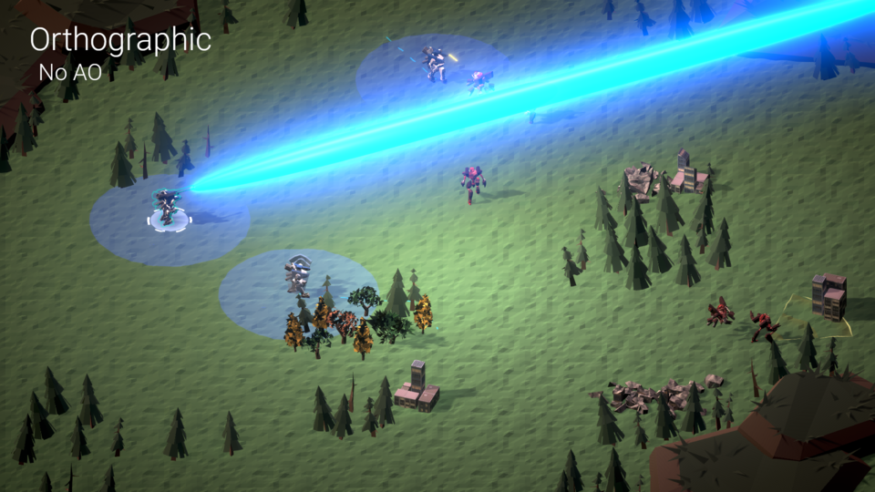
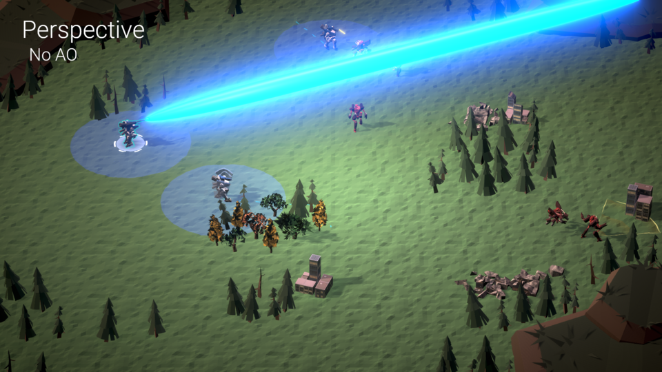
The difference is especially pronounced in cinematics. If we used an orthographic camera, blends between shots would feel much more static, as you wouldn’t be able to see different sides of objects as the camera moves around. Here’s what a camera pan looks like with the perspective camera in the game, at half speed:
I think this style of camera adds a lot more dynamism to the scenes and more firmly grounds the player in the world. After all, humans don’t see the world through an orthographic lens.
Additionally, Unity’s ambient occlusion doesn’t work with orthographic cameras. We’ll get to AO below, but this was a huge dealbreaker for us when using orthographic cameras.
That being said, making the switch was not a total no-brainer. There were two pain points, somewhat related, in developing with this low-FOV style of camera:
- The camera needs to be really far away from the actual scene to look reasonable.
- That means that you need to be constantly adjusting your clip planes when you move your cameras, otherwise your depth textures become poor quality.
Because of this, I ended up developing a small editor utility to aid in manipulating these cameras. The editor script does two things to solve these two problems:
- It adds a transform/rotation/scale handle at the center of the near-clip plane.
- It adds a button to the camera to automatically resize the clip planes to approximately the right locations.
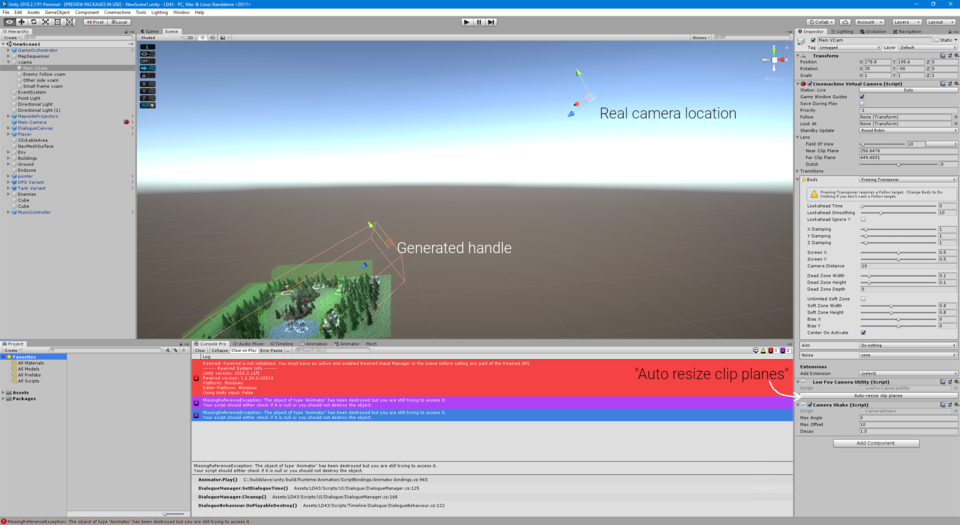
I’ve posted this editor script as a gist.
Postprocessing
First, let me admit something: our process for coming up with the postprocessing settings was extremely unscientific. We sort of just threw stuff at the wall and saw what stuck. However, I’ll attempt to describe my theories for why these things might have worked.
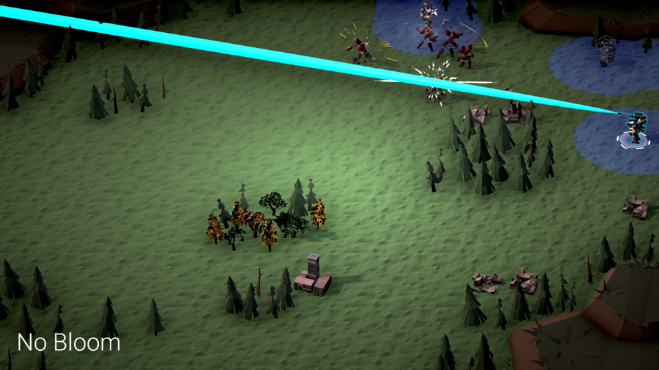
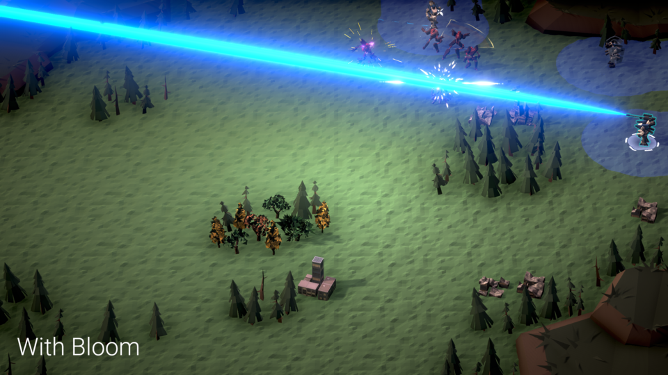
Bloom
With nothing in the scene, bloom doesn’t do a whole lot except making the environment a bit shinier. It becomes most noticeable when there are combat effects present in the scene. The effects for downed enemies look much more dull without it, and the coolness of our laser beam entirely depends on it being present.
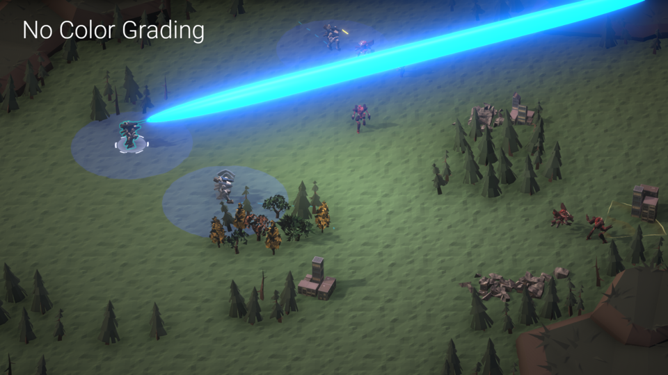
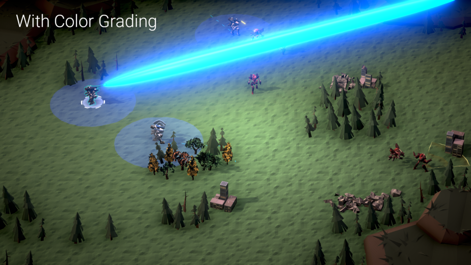
Color Grading
We’re only using the contrast and post-exposure modules of the color grading settings. Even only these two things made our colors pop out a lot more. Without them, our scenes look much less colorful.
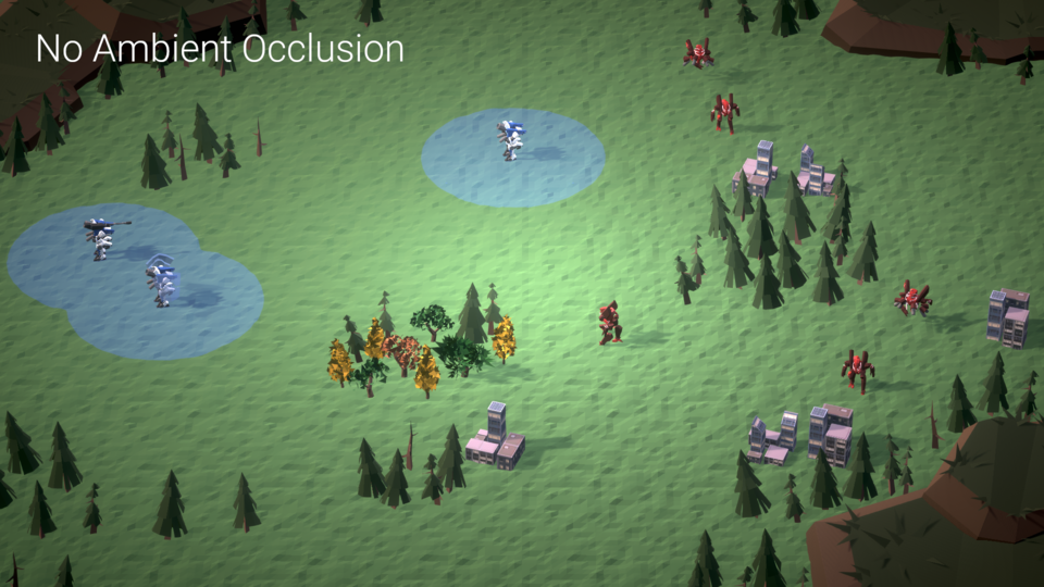
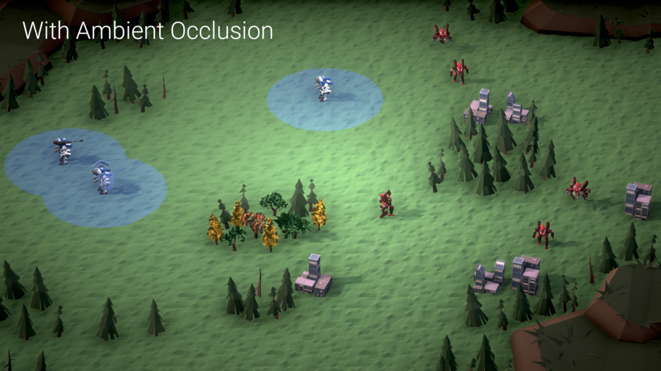
Ambient Occlusion
This was the big win for us. Turning on ambient occlusion simply made everything look better. I believe the reason is that it helps ground many of the elements in the scene. Without it, many of our environment assets, such as the trees, look like they’re floating.
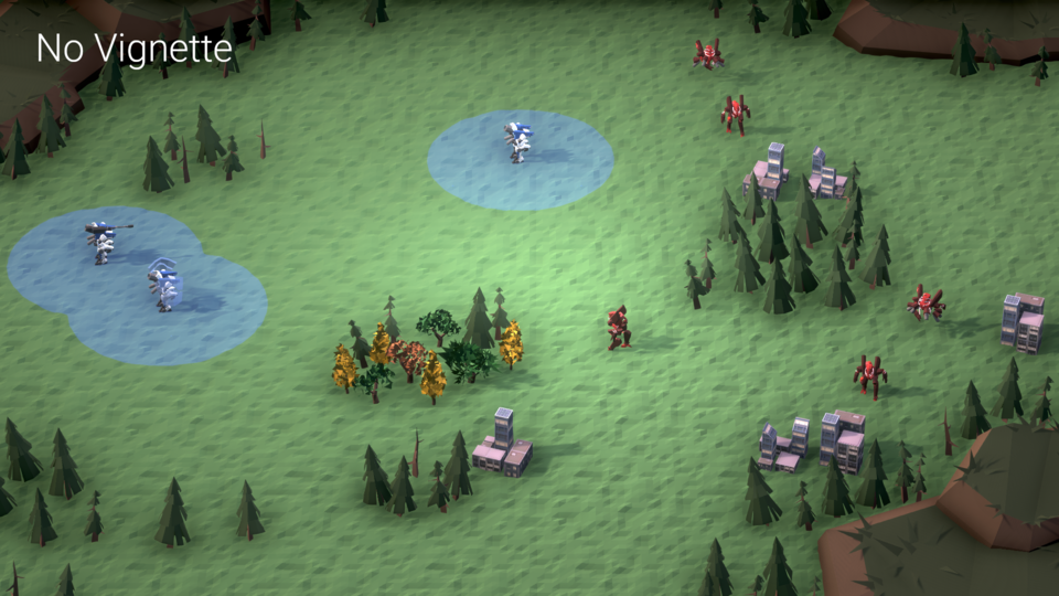
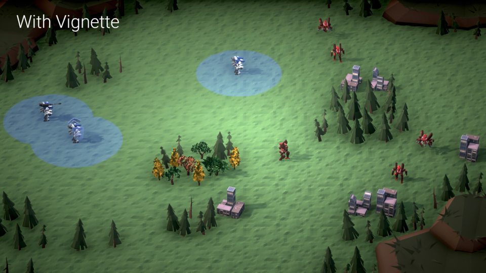
Vignette
Vignetting the scene isn’t exactly necessary, but it helps draw the player’s attention towards where the attention is happening: the center of the screen.
Lighting
Coming up with the lighting setup for RiftCore was similarly feel-driven. Neither person on our team is an expert in lighting, so we tried a bunch of things and went with whatever looked best. Here is the general setup we use:
- Two directional lights: one for main lights, and one for highlights.
- One pointlight placed at the center of the battlefield.
- Realtime global illumination only - no baked illumination.
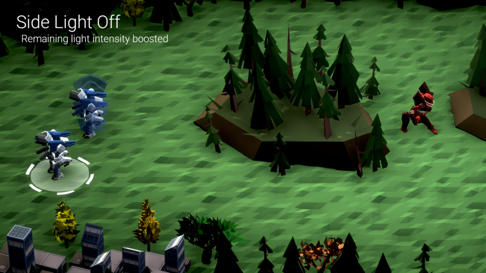
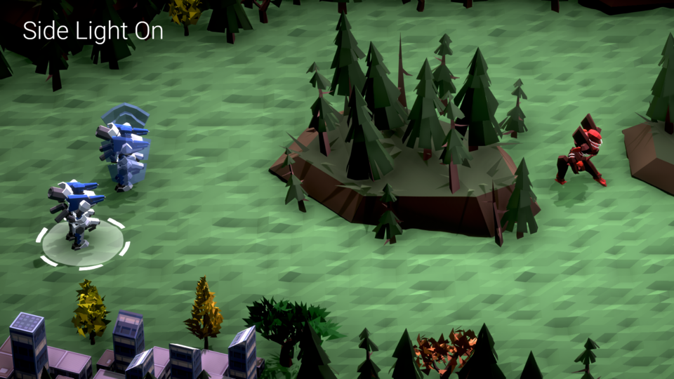
Two directional lights
Why two, and not one? It’s hard to explain the difference in words, so here is a closeup before/after. Beyond the scene simply appearing brighter, you may be able to see the slight pink highlight or “rim light” on the edges of mech parts. This is still noticeable even at far distances.
Center point light
Our initial idea for a style came from Overland, which looks a bit like this:

The most notable part of the screenshot, to us, was the interesting gradation in the colors on the battlefield. The center of the map is much more lit than the edges. We weren’t sure if it was simply a screen-space vignette or if there was more to it.
To achieve a similar effect, we ended up placing a point light in the center of our battlefield. The point light sits far above the ground and has a high range and intensity. This obviously isn’t realistic, but, hey, it makes the game look much more dynamic.
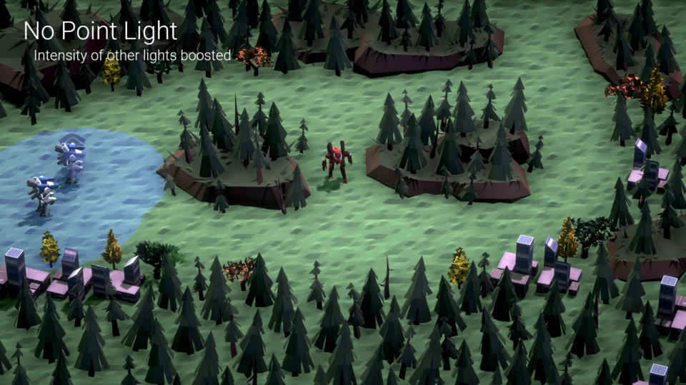
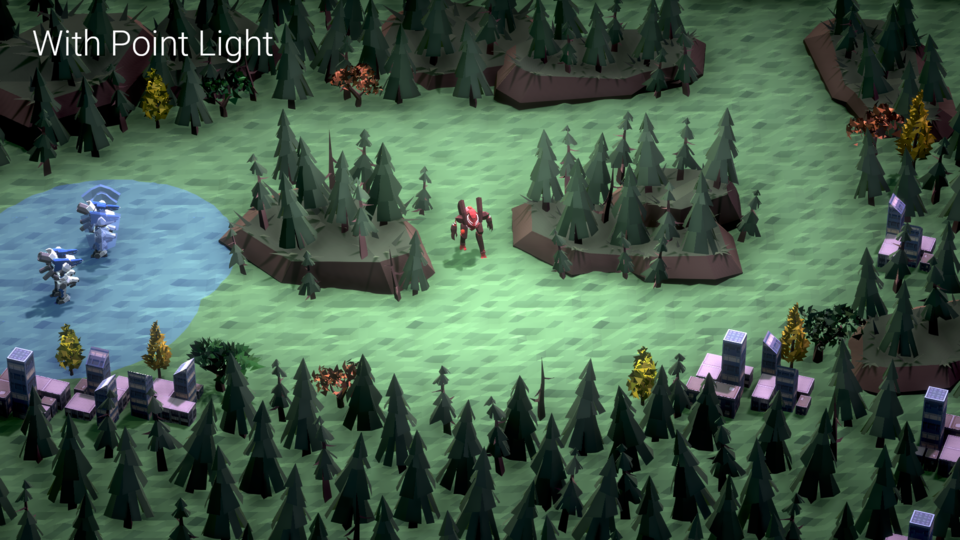
One downside of this approach is that it lightened the shadows nearer to the center of the battlefield. In fact, this is why most of the environment assets don’t cast shadows - we purposefully set it this way to make the point light effect less noticeable.
I think it would be possible to manually generate a shadowmap from only a single directional light, bypassing Unity’s default generated shadow passes. However, this would take a fair bit of work, and we think the overall effect still looks good despite the lack of shadows.
Realtime GI
Honestly, I can’t explain this one at all, as I don’t have a very deep knowledge of how global illumination works. All I know is that the game looks a tiny bit worse without it.
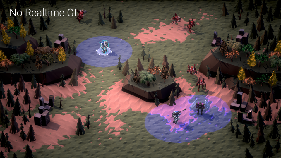
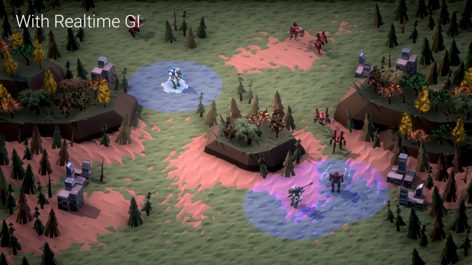
We also tried baked GI but it didn’t look quite as good. Besides, our scene sizes are quite small, so realtime shouldn’t be a huge drain on resources.
Conclusion
As I said in the opener: I’m primarily a programmer and am somewhat poorly equipped to solve the problem of “good style”. Having now gone through this process, I think the greatest asset someone can have is a strong sense of what looks good and bad. Once this sense is developed, it’s simply a matter of knowing what your options are, trying a ton of them out, and seeing what passes the sense test.
This feel-driven development is somewhat anathema to how I normally solve problems as a programmer, but is totally normal for a large range of artists, and so it is something I am attempting to develop.
In the next post in this series, I go over the decal system we used to display attack indicators, movement paths, and more. Thanks for reading.