I’m Ed Lu, principal engineer on Wizard with a Gun, which released in October 2023. This is the fourth in a series of articles about the engineering behind the game. Read the previous one, about state divergences, here.
Wizgun’s visuals are a hybrid of 2D and 3D objects. The characters are all 2D planes animated with Spine, whereas the environment is composed of 3D meshes. Many of the particle effects are 2D flipbooks. Most of our ground is a 2D tilemap, but the cliffs below the ground are 3D.
Unity allows a lot of flexibility in how you structure visuals, which is nice for authoring, but a pain for implementation. Our artists and designers consistently put together great looking assets, but it fell to the engineering team to pull it all together into a cohesive art pipeline. It ended up being an extremely iterative process where we’d fix one bug, only to discover another, and fix it, and discover another, ad nauseum, until everything looked good enough.
This article is a list of every single technique, trick, and outright hack that we used to get 2D and 3D objects to play nice.
Sorting 2D Characters with 3D Environment
Wizgun’s characters - a blanket term for the player avatar, NPCs, and enemies - all use Spine 2D for their animations. This gives our game a unique look.
Since the artist has already drawn these characters from an isometric point of view, they must be billboarded against the camera to appear correct. That means all of our characters are tilted in worldspace:
The left side shows a character from an in-game camera. The right side shows the same character from a rotating camera, showing that the character is indeed billboarded towards the desired point of view.
The character looks great billboarded like this, but we quickly run into problems when we move characters against 3D objects:
When our player runs up to this wall, we don’t expect them to intersect with it - we expect them to stand in front of it. Since we tilt all of our characters, it’s easy to see why this is occurring:
The tilted 2D object attempts to depth-sort with the wall, leading to clipping that we don’t expect.
Billboarding the 2D characters looks right, but intuitively, the player doesn’t actually expect the characters to be tilted like that. Characters look like they’re standing upright. When you stand in front of a tree in real life, you don’t lean at a forty-degree angle with respect to the tree - you stand upright in front of it!
So what if we treated characters as if they were standing upright, even though they’re tilted? I was introduced to this technique by the venerable Ben Golus on the Unity Forums. Here’s a basic rundown of how it works.
Our characters remain billboarded, facing the camera. I created a custom shader for all 2D objects in our scene. For characters, I duplicated Spine’s Skeleton shader. For static sprites - for example, dropped items - I duplicated Unity’s Sprite shader. Then, in the vertex shader, I:
- Grab the pivot position of the character.
- Create a ray from the current vertex position to the camera position.
- Intersect this ray with the plane that:
- Contains the pivot position of the character
- And whose normal is the inverted camera view direction with the Y component set to zero.
- Calculate the clip position of the ray’s intersection point.
- Pass this clip position to the fragment shader instead of the typical clip position.
Essentially, what we are doing here is stretching the mesh into an upright position, but with the right skewing such that the visuals remain unchanged with respect to the camera view.
I call this transformation “upright correction”.
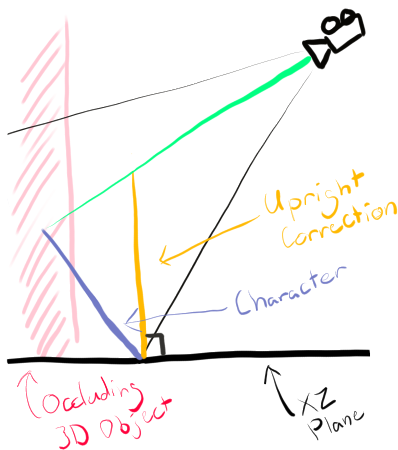
With this change, the character depth tests with the 3D environment as if it were standing upright, even though the visual remains the same.
Note that the character does begin clipping with the wall as the camera tilts away from the expected view rotation. The plane we project onto is calculated based on the camera view, so this clipping occurs when the angle changes from the expected one.
Characters can still clip awkwardly with objects if they stand too close:
But this is normal, and would happen with any game, even if both characters and environment were 3D. It is mostly solved by wrangling our colliders such that our characters can never get this close to objects.
Sometimes, we want to attach sprites to a character that aren’t part of the Spine object. For example, this fear mask appears over characters’ faces when they have the Fear status effect applied:
Upright correction also must be applied to these attachments or they suffer the same kind of clipping problems. However, there is one important difference in the shader math. Instead of grabbing the pivot position of the sprite and using that to calculate the projection plane, the pivot position of the character must be passed to the shader and used instead. Then, the same math is used to force the attachment upright with respect to the character’s origin.
Sorting 2D Characters with Particles
Particles present a particularly tricky sorting problem when they need to sort with other transparent objects because all particles are drawn in a single pass. The easiest example is our ground foliage, which uses a particle system for performance. Without modifications, foliage cannot sort properly with 2D characters:
In the above video, you can see that the foliage incorrectly draws in front of the player. In a traditional transparent pipeline, the only way to get it to sort properly would be to issue multiple draw calls. First, the foliage behind the player would be drawn, then the player would be drawn, then the foliage in front of the player would be drawn. This is bad for performance, especially when multiple characters means multiple such splits.
Similar problems occur with VFX that are made to look 3D. It’s subtle, but the below explosion effect has the same problem: all the fire explosion particles draw either above or below the character. In the video, you can see that when the center point of the particles moves in front of the character, the entire particle effect suddenly decides to pop in front of the character.
My first approach to solve this problem was to use an alpha test material on characters. Doing so would allow them to write to the depth buffer and easily depth-sort with these effects. However, the drop in quality versus an alpha-blended material was not acceptable. Unfortunately, a video crunches the quality too much to tell the difference, so you’ll just have to trust me on this.
Instead, I’m using a two-pass technique I first saw on Wolfire Games’ blog.
The first pass of any character material renders the visuals with alpha blending, as normal. The second pass renders the character only to the depth buffer using alpha testing. This mostly gives us the best of both worlds, avoiding the jagged edges of alpha testing while allowing us to sort nicely with other 2D transparent objects.
However, using a two-pass shader that writes depth on Spine objects is a no-go. Since Spine objects are made of multiple pieces which exist in the same plane, they begin z-fighting.
I actually fixed this problem once already when trying an alpha test material, as it also wrote depth. With the alpha test material, I managed to get around it then with a stencil trick. I swapped the draw order of the spine parts, drawing front-to-back. The shader which drew the character emitted a bit to the stencil buffer, and discarded fragments where the stencil bit was already set. Unfortunately, this trick doesn’t work with alpha blending because the character’s parts wouldn’t be able to blend with each other, and we’d get seams where the alpha didn’t meet the cutoff.
The fix that Spine provides is to separate the individual meshes of the spine object by a small distance along the normal of the plane. This fixes the z-fighting, but introduces unacceptable warping when rendering characters at the edges of our screen due to our perspective camera setup.
Finally, I came up with the solution we ultimately shipped with. Instead of a two-pass shader, we use two shaders - the alpha-blended visual shader, and the alpha-tested depth-only shader. We first draw all characters using just the visual shader in their own sorting group (named Beings) as one of the first groups drawn in the transparent pass. Then, in a second group (named BeingsDepth) drawn right after the Beings group, we draw all the characters again using the depth-only shader.
With this approach, foliage and other 3D transparent effects sort correctly with our characters.
Why does this work? Characters know how to sort with each other, because they’re all billboarded planes that are sorted based on their distance from the camera. The characters themselves do not need other characters’ depth information (or their own) to sort properly with other characters. What needs to have that depth information is VFX and other particles, and we ensure that those transparent objects are drawn after the BeingsDepth group is all done.
Mixing Upright Correction with Depth
Recall that “upright correction” involves projecting characters onto a plane that is perpendicular to the XZ plane, and is necessary for correct sorting with 3D objects. Initially, I applied upright correction to our depth-only writes as well, because it seemed to make sense. However, I quickly found that this was not the correct approach due to the way our effects were being authored.
For instance, our VFX artist created this cool fire effect:
This VFX gets attached to characters when they’re on fire. However, this VFX is billboarded to the camera. Since I was applying upright correction to the character’s depth-write, this VFX was always hidden, since it was tilted away from the camera, and the character’s depth write was tilted towards the camera.
I could, of course, force the fire VFX upright using the same shader calculations I did for the other character attachments. For a time, I tried doing this. However, there were a lot of VFX coming in, and it was impractical for me to keep track of all of them. At the same time, it’s not always obvious to a VFX artist when it is appropriate to apply the upright correction and when it is not. Instances of sorting issues would constantly slip through.
These problems eventually led me to a stop using upright correction on depth writes altogether. Upright correction is applied characters’ visual shaders, but the depth-only writes are kept billboarded against the camera. That way, any billboarded VFX drawn after characters still sort correctly with characters, because the depth write is billboarded. And at the same time, the character still sorts correctly with 3D objects, because their Spine renderer sorts with 3D objects as if it were upright.
It’s a very weird solution to a problem that is more about workflow than it is about technical challenge.
Displaying Characters through 3D Environments
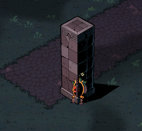
A visual design challenge in our isometric perspective is clearly signalling enemies and loot when they might otherwise be occluded by tall objects, such as trees and pillars. We use a combination of techniques to achieve this.
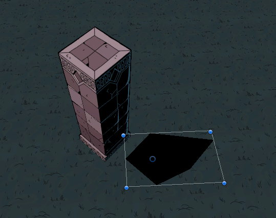
The easiest to see is that we render enemies, allies, and loot in a solid color when they are behind an object:
This is achieved by using the stencil buffer. 3D objects write a specific bit in the stencil buffer. Important objects (enemies, loot) that ought to be shown contain a second pass in their shader which renders a solid color if the stencil bit is present and the depth in the depth buffer is greater than their current depth.
I feel that this effect could be made better stylistically had I more time, but it is effective enough at showing objects that you should pay attention to and would otherwise not see.
Dithered fadeout
When the player is behind an object, the top of the object fades out entirely:
We have a separate effect for the player specifically because I didn’t want our game to devolve into a bunch of colored blobs shooting other colored blobs. In this way, the overall effect is very purposeful - but the implementation is not.
In particular, the choice of a dithered fadeout is not the result of a decision by the artists at Galvanic. In fact, this effect was the subject of much contention and gnashing of teeth, both from me and other team members. The dithered effect we shipped with is an extreme compromise. Let me walk you through the iteration process.
We started by moving objects to the transparent queue and using a normal alpha-blended fadeout when the player is behind them. This runs into problems with self-sorting. Note how parts of the back of the model pop in when we swap to the alpha-blended shader.
However, there is a solution to this. Since our camera angle never changes, we can sort the triangles in the mesh back-to-front based on the view direction of the camera to force Unity to draw them in that order. It will look incorrect from any camera angle other than our fixed one, but we don’t care about this because we will never render from any other angle.
If you’re interested in some Unity-specific code for sorting triangles, here it is in a gist.
This looks great! But there’s two main issues that became insurmountable enough that we abandoned alpha blending.
The first you can see in the video above: the post-processed outline we use (covered in a section below) pops out when we swap to the alpha blended shader, and pops back in when we swap to the opaque shader. This is not terrible and maybe could be glossed over, but the bigger problem is that our character sorting issues are back:
Notice how the top of the character’s head gets clipped while the object is fading in, and eventually fixes itself once the object swaps back to the opaque material.
Since our characters write to depth, ostensibly, this should not an issue. However, recall that in the previous section on upright projection vs depth, we chose to keep the depth write billboarded instead of forcing it upright to deal with some VFX sorting issues.
Okay no problem - just force the depth write back upright, and deal with the issues with VFX sorting, right? I went back and forth on this for a long time. After forcing characters’ depth writes upright, we consistently ran into the sorting issues with VFX and other transparent objects I mentioned in the previous section. Again, none of these problems were individually insurmountable, but they just kept cropping up.
Eventually, I decided enough was enough. If I couldn’t make 3D objects transparent, then I would keep them opaque. Dithered transparency is a fairly common technique used to keep objects opaque while giving a sense of transparency, so I opted for this technique. However, it came with its own problem.
Usually, dithering is only used as a very quick in-between state between fully opaque and fully faded out. In Wizgun, our objects are statically faded out while the player is behind an object. And when continually displayed like this, dithering has noticeable problems.
In particular, achieving a dithering pattern that is locationally stable is very, very difficult. Usually, the dither pattern is sampled in screen-space. This is fine when you only see the pattern for a half-second fade-out, but you get some bad pixel swimming when it’s present for a longer time, almost like you’re seeing the object through a screen door.
I’ve scaled this video much larger so the pixel swimming is more noticeable. It is especially egregious when the camera interpolates to a stop.
I never managed to fully solve this problem. I’m aware of various techniques - Lucas Pope’s being the most well-known, and Rune Johansen’s being the latest I’ve seen - but I simply didn’t have the time to make them work.
Instead, I opted for a less-than-perfect approach, where the dither pattern is pinned to a world-space point. In an orthographic projection, this would result in a perfectly stable dither pattern, but since we opted for a perspective projection, the perspective warping still results in some jitters as the camera interpolates to a stop. Still, it’s far better:
This is the final effect we ended up shipping with.
To be honest, I am less than happy with the style of this dithered fadeout. It’s simply not in Wizgun’s style. I really wish we could have made the alpha-blended version work, and perhaps with more effort, I could have found a way. But with so much other work to do, the result we had was good enough.
One last note on this fadeout effect: When the object is faded out, I render the backfaces of the object in black. For objects with backfaces, this gives a decent illusion that the top of the object has been removed, and not just the front. Not all of our objects have backs, though, so it works better on some objects than others.
Sorting 2D Characters with 2D Tilemap
Lots of our characters’ pivots aren’t at the bottom-most point of their spine objects, so their feet or other appendages could intersect into the ground plane, causing unwanted clipping.
This was especially noticeable with the Fell boss called Orion, who has tentacles that writhe all over the place:
On the right side, Orion’s depth sorting is turned off and you can tell that their tentacles are below the ground in 3D space.
In most cases, solving this problem is quite simple. Since all our characters and items are above ground, we set the ground plane to draw at the absolute beginning of the transparent queue. That way, all of Orion’s multifarious tentacles draw above the ground.
As always, there are edge cases.
Sorting 2D Characters when in Water
The above solution works as long as the ground has no elevation changes - that is, characters always sit above all parts of the ground. This is true in most cases, but when in water, a character’s height drops slightly, and they should be obscured by parts of the ground.
Here, it’s supposed to look like the player is in the sludge, but instead it looks like they are standing on the ground just above it. A similar problem exists with the reeds to the upper-left of the player.
I never really found an elegant way to solve this problem. I took a kind of brute-force approach:
- Early in rendering, we use a depth-only shader to render all non-water tilemap depths to a separate texture
- In code, we know when a character is in water (we lower their visual and play water ripple VFX). We send an
IsInWaterboolean through a shader uniform - In the fragment shader, we check if the character is in water and do a manual depth sort against the tilemap depth texture
It’s fast enough, and it works:
Notice that the player’s legs and waist are now hidden by the tiles, as well as the bottom of the reeds. Please ignore the fact that the player’s shadow remains unclipped in the above video… Evidently a bug we have yet to fix, one among the pile.
Sorting 2D Characters with “3D” ground
Late in the project, we had a concept for a boss arena that used 3D objects for ground instead of tilemaps. When I saw this, I immediately groaned. To review:
- 3D objects can’t turn off depth sorting because doing so breaks their self-sorting
- 2D objects on top of ground can’t depth sort with ground because there may be appendages below their pivot point which need to be rendered above the ground
So I hacked it. I imported the 3D objects into Blender and separated the top part of the 3D object (which is flat) into its own mesh. Then, I put that separate mesh into the same render queue as our normal tilemap ground, and turned off depth sorting in its shader.
Sometime, a hack is just good enough.
2D Tilemap Shadows and Overlays
Our “shadows” are simply meshes baked into our 3D objects.
Of course, this means that they’re not projected onto ground in any special way, and can appear even if there is no ground to receive that shadow:
A separate, but related, problem is the way we render elemental ground overlays. These appear if a spell splashes poison, water, or another element onto the ground. These are visually represented by randomly-rotated sprites that overlay the ground. Sometimes the rotation is such that these overlays can hang out over the void - not super noticeable, but nonetheless:
To solve this, I use the stencil buffer. The ground tilemap writes a bit to the stencil buffer. In the fragment shaders written for shadows and overlays, they check this stencil buffer bit and discard the fragment if the bit is not set.
Sorting 3D outlines with Transparent Objects
The idea behind rendering outlines on 3D objects is to give them the same hand-drawn, line-art quality that our 2D characters have. On 2D characters, the lines are simply in the art. We can’t bake outlines into 3D objects the same way, due to perspective distortion, so we must do it at runtime.
Wizgun implements a depth-based, post-processed outline. It is similar to this tutorial, though I’m not sure where the original author of ours got the idea from.
By default, since this is a post-processing shader, the transparent objects that are drawn before the post-processing occurs do not understand how to sort against the outlines, meaning the outlines are drawn on top of them. In the below screenshot, you can see that all the background objects’ outlines show up through the tilemap, which is part of the transparent queue. In addition, there is a line drawn through the wizard’s hat where an outline is being drawn across the base of the Research Mechana.
Weirdly, I do not see this problem talked about anywhere. Perhaps it’s because most tutorials assume that only opaque objects are drawn.
In any case, the solution I came up with was to write depth information about the outlines into the depth buffer. When sampling depths around the current pixel in the fragment shader to determine whether the difference is great enough for an outline to be drawn, we save the minimum depth sampled. Then, if an outline color is written to the screen buffer, we also write that minimum depth to the depth buffer.
In Unity’s builtin pipeline, this can be done in a command buffer by using the RenderTargetIdentifier depth argument of SetRenderTarget. Then, in the fragment shader, return a struct containing the SV_Depth semantic, whose value will be written to the depth buffer that was passed.
Since we now write depth information about the outlines, we can draw the outline post-processing effect before the transparent queue, and transparent objects will correctly depth sort with the outlines. Here is the final outline effect:
Other Notes on Wizgun’s Outlines
While working on Wizgun, I quite literally randomly stumbled across this tweet from Ben Golus about using normals to improve the quality of outlines. I implemented the normal reconstruction technique in the article linked and it did improve our outlines a decent amount, with a small performance cost.
I also implemented colored outlines, which can be seen when standing next to an interactable object.
This is achieved through several steps:
- I blit the object which should receive the color to a separate fullscreen buffer, called
OutlineColorBuffer. - In the outline post-process shader, when sampling depth around a fragment to determine whether to draw an outline at that location, I also sample
OutlineColorBufferat those locations. - If the location at which we sampled the minimum depth contains a color in
OutlineColorBuffer, then use that color to draw the outline instead of black.
Other Visual Tricks
These tricks don’t explicitly deal with our 2D/3D hybrid approach, but I feel like they’re worth calling out anyway.
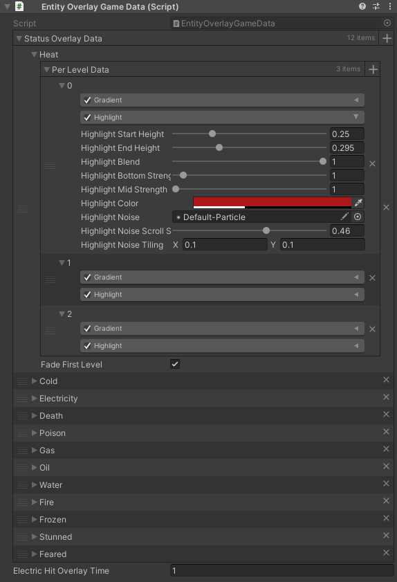
Status Overlays
When a character or object is affected by fire, cold, poison, stun, or any other status, we apply what I call a “status overlay” to the object. The effect was directly translated from this piece of concept art by Royce McLean:
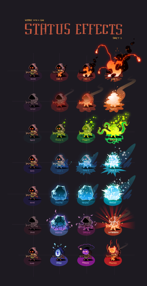
There are a lot of elements to these status effects - VFX, lights, sprite attachments - but the one that caught my eye was the overlays that are applied to the player. This required some tech art setup. Here’s the resulting effect implemented in-engine, in an editor preview:
This effect is applied directly in the Spine and 3D objects’ master shader. It consists of:
- An additive two-color gradient, fading from one color to another from bottom to top
- What I call a “highlight”, a texture which is alpha-blended into the object’s texture and fades from bottom to top
Since both of these effects rely on knowing where an object’s “bottom” and “top” are, I wrote a custom system which serializes each object’s renderer bounding box and, at runtime, passes it to its shader uniform.
I also wrote a set of tools to put together these overlays, which I’m still pretty proud of. It consists of the below editor to edit the gradients and highlights, which can be tweaked for real-time feedback in conjunction with the editor preview shown in the video above.
Lighting
We have a basic forward lighting system in our game which supports up to 16 lights. We completely bypassed Unity’s lighting system for this and wrote the lighting calculations into all of our Wizgun shaders.
Our lighting system supports what I called “light cookies”, which simulates cloud shadows, lending some lighting dynamism to our scenes. It’s sped up 5x in the following video to make it more noticeable:
These cloud shadows are per-biome (detected based on the type of tiles around the player), meaning we can get some variance in the feeling of each biome. The Barren Sea is super sunny with few clouds, and the Fell is extremely cloudy and oppressive.
Like the status overlays above, I wrote some basic editor tooling for this, allowing our artists and designers to quickly tweak variables to achieve those different feelings.
Our tilemaps also support basic normal mapping, which breaks up what would otherwise be perfectly circular point lights:
Post-processed Glow
This is a very basic implementation of bloom which:
- Renders glowing objects to a separate fullscreen texture
- Downsamples the texture
- Renders it into the screen buffer
Cheap and effective.
Foliage sway
The ground foliage shader implements a basic wind sway effect, which is basically just a sine wave. There is also some extra sway that only occurs when the player walks through the foliage.
This effect is achieved through several parts:
- A particle system at the player’s feet emits blurry white circles by distance. The circles quickly fade over time.
- This particle system is not rendered by the main camera. It’s instead rendered to a separate fullscreen “sway” buffer.
- The foliage shader samples the sway buffer at its screen position.
- A secondary sway amount is added to the normal wind sway, multiplied by the value of the sampled pixel in the sway buffer.
Circle shader
This circle that appears below characters scales with the characters’ size:
Originally, this circle was a texture that scaled up and down, but since scaling the texture scaled not only the radius of the circle, but also the thickness of the edge, it looked super blurry on large entities. So instead I wrote a quick shader to render the circle onto a quad.
Kind of a stupid and simple trick, but it’s worth calling out just to show how much tech art is necessary for a game of this size.
Conclusion
The 2D/3D hybrid nature of Wizard with a Gun caused problems from start to finish. Every time I thought I was done tackling problems, another one would come up, and I’d have to divert some attention to it.
Often, the problems that cropped up were related to a solution that I’d previously implemented. The intertwined nature of the character depth pass and the dithered 3D fadeout was emblematic of this. There never existed a singular lever that I could pull to solve all problems. Even now, sorting problems still exist. It’s just that the problems became less noticeable over time, until they reached a point where the game looked good enough.
As with everything else, our visuals were a product of many prioritization decisions made over and over. This process resulted in a striking-looking game with, yes, a few visual flaws - but I’m still extremely proud of the result.