I’m Ed Lu, principal engineer on Wizard with a Gun, which released on October 2023. This is the second in a series of articles about the tech art. Read the first one, about ground tiles, here.
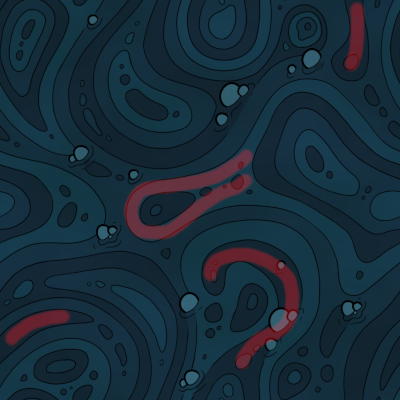
I was largely responsible for all of the technical art on the project. This article is about the water shaders that I created. I was tasked with implementing the style in this piece of concept art:
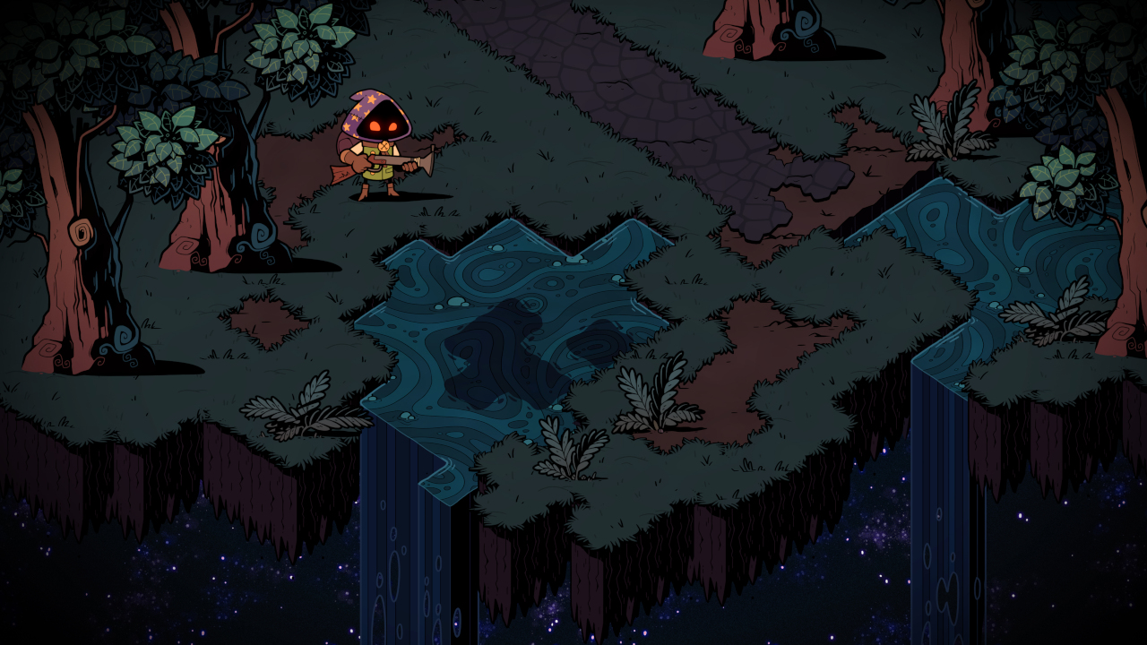
There are quite a few effects forming the water in this concept art. I’ll enumerate them one by one.
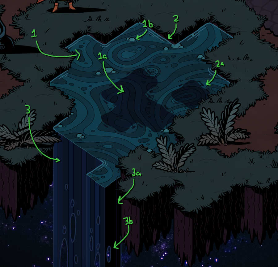
1. Main Water
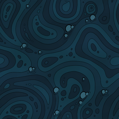
Here’s the main texture that is projected onto the water surface in the above image:
Obviously, we don’t want this texture to be a static, unmoving image - water moves. But it’d also look very uninspired if we simply scrolled the texture across the surface of the water. Real water has eddies and turbulence. How can we achieve those effects while retaining the spirit of the concept?
Let’s break down what’s in the texture. The immediate feature that sticks out is the even bands of alternating blue colors. Let’s replicate that effect in motion.
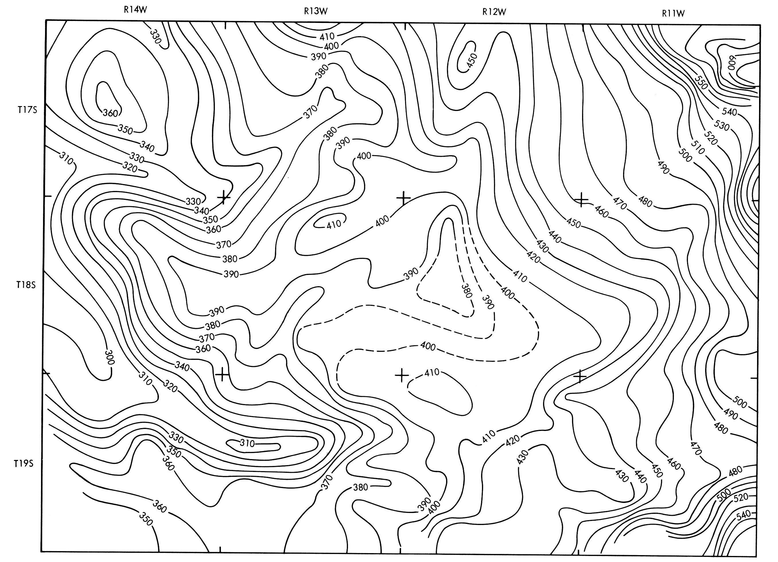
Instead of imagining the water as bands of color, start imagining it as a bunch of contour lines. By contour lines, I mean the lines laid on top of a map to denote height:
Once we start thinking of these as bands of heights, then we can think of the water texture itself as a heightmap:
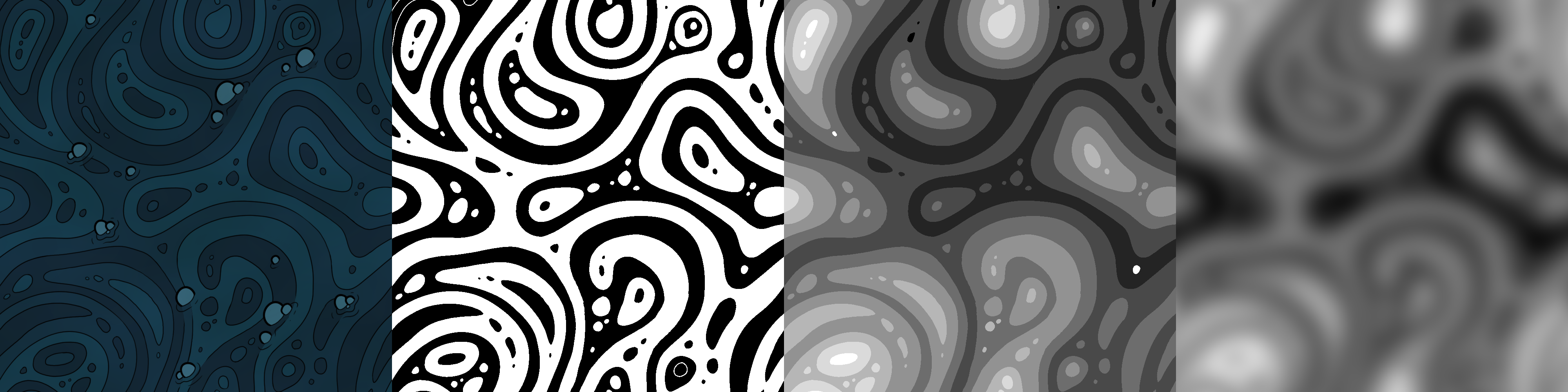
From left to right, the images are:
- The original texture
- The original texture with each band of color clearly separated using black/white
- Each band of color assigned a grayscale value from 0 to 1
- The previous texture, blurred, and with some color adjustments for tiling
You can think of the final texture as a heightmap where 0 (full black) is a valley, and 1 (full white) is a peak. We can work backwards from the final image to the first one by applying the following algorithm:
- Define a number of bands. This affects the thickness of lines in the final image. For our example, we’ll use five bands.
- Define some colors. In our case, if you inspect the original image, you’ll see that there’s only three shades of blue which alternate across the bands.
- Divide the range of values (0 to 1) by the number of bands: 0 -> 0.2, 0.2 -> 0.4, etc.
- Map each band to a color: 0.0-0.2 → blue1, 0.2-0.4 → blue2, 0.4-0.6 → blue3, 0.6-0.8 → blue1, 0.8-1.0 → blue2
Note that these “contours” of height are commonly known as isolines. To draw isolines in our water shader, I use a method inspired by this shadertoy.
The Heightmap
Now that we have a method to translate a heightmap into a bunch of bands of color, we can go about procedurally generating a heightmap that bubbles and froths a bit like real water.
My first go-to for this was perlin noise. If we grab a perlin noise sample at each point on the surface of the water and scroll this over time, we can get something that’s close to what we want:
It doesn’t look bad, but I had a lot of trouble with this approach appearing too regular across large bodies of water. Perlin noise wasn’t generating the long, flowing shapes in the original concept art.
I ended up ditching the perlin noise, and instead chose to use the blurred heightmap shown in that 4-step image above - this one:
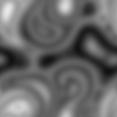
Using some techniques from a GDC talk from blizzard, I blend together two samples from that, scrolling in different directions/speeds. I think it does a better job of replicating the style present in the concept, though the texture filtering can make it kind of blurry when closer-up.
Honestly, it’s a matter of taste which you prefer - the more regular noise or the less-regular one. There’s still some work that could be done to make this better. For instance, I applied a uniform blur to the heightmap, which causes us to lose the high-frequency details, like the small spots, which would contribute more detail. This heightmap would have to be manually painted, and I’m not sure of the technique we’d use to do so.
1a. Deep Water
Changing from normal water to deep water is very simple. The shader exposes the colors which each band is mapped to. For deep water, we simply create a new material which samples from the same heightmap values, but maps them to darker blue values.
We can also use this technique for poison water. We map heightmap bands to green colors, and make it scroll much more slowly.
1b. Bubbles
If you have a keen eye, you may have noticed that the original concept art has some bubbles in it:
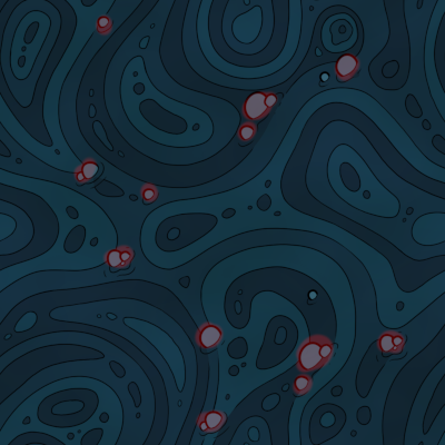
I erased these when we created the heightmap. To bring those bubbles back, I created an entirely different system which leverages Unity’s job system for particles. The system dynamically creates bubble particles and destroys them when they reach the edge of the water.
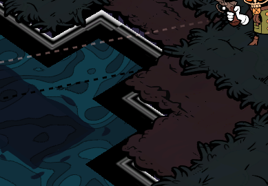
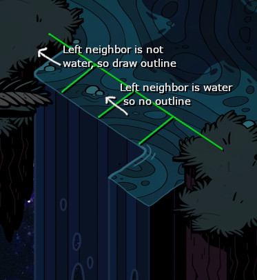
2. Water edge outlines
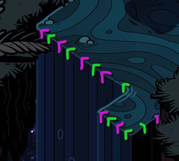
The water edges are laid out using the same skirt system as the first article in this series. The technique is slightly modified since the skirts are generated on the inside of the tiles, rather than the outside, but the principles are exactly the same - selection of half-tiles based on neighboring tiles. Here is the tilemap which we use for the water edges:
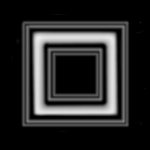
Here’s what that looks like:
I apply a shader to this tilemap which samples the data texture, as well as some perlin noise. Here’s the perlin noise without the texture:
I add the noise and the skirt texture values together. Then, we only show each pixel if it is above a certain threshold. Here is the result, sped up so it’s more noticeable:
Since the inner rectangle of the data texture - the piece closest to the shorelines - has a very high value, it will always meet the threshold. As we get further from the shore, that inner rectangle fades and the perlin noise takes over, leading some subtle burbling.
The additional rectangles are darker than the threshold. That means they won’t be shown at all until, when high-value noise happens to intersect those rectangles, they are pushed those over the threshold. That leads to the scrolling lines on the outside of the shorelines.
2a. Deep Water Outlines
The deep water outlines use the exact same principles. It’s a skirt (albeit a normal outer skirt this time), and we elevate Perlin noise using a mask. We’re even using the same shader. The only different thing here is the mask - it has much thicker rectangles:
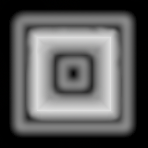
Which leads to thicker areas where the noise can be present.
3. Waterfalls
Our waterfalls use the same cliff system as the normal cliffs under grass and dirt and such. The waterfall meshes are just cubes stretched along the Y-axis.
The first thing to notice is the color bands on the waterfalls. The bands in the concept image match up with the noise pattern on the main water:
This is a very simple effect to achieve. The waterfalls’ shader samples the same noise pattern exactly the same as the main water surface. Both are using world-space XZ position to sample noise; since the waterfalls’ faces are aligned to the Y-axis, the sample will get stretched along the Y-axis.
The only tricky thing with the noise pattern is the dark edge:
The colors get inverted - the isolines receive color, whereas the bands don’t. In the shader, we achieve this by checking the world normal of the surface we’re drawing on, and inverting the color if the normal faces more along the Z direction.
2a. Waterfall Outlines
The waterfalls themselves have a couple of subtle outlines:
This gets a tricky to pull off because it’s hard to know when we’re near an edge in a shader. I’ve achieved this effect using a few steps, some of which are out of shader.
First, the edge information is passed through the vertex colors in the mesh. The cube used as the waterfall meshes has vertex colors manually painted in:
Recall that our camera orientation is fixed, so this is always the angle we’ll be looking at the cube from. Red represents the left edge, green represents the middle edge, and blue represents the right edge.
We can use these gradients to color in the edges of this cube using a configurable threshold. For example, if we want the left edge to receive an outline, in the fragment shader we can check if the value of color.r is greater than some threshold, and use the outline color instead of whatever color would normally be there.
Unfortunately, that’s only part of the solution. Since we place an individual cube under every tile (details in the predecessor article), a contiguous side of one waterfall can be made up of multiple meshes. We only want to color the left-most edge of the left-most cube, and the right-most-edge of the right-most cube.
To achieve this: In the system which generates cliff data, we also collect a map of cliff position → existence of north/east/west/south neighbors. Then, in the job which processes the cliff particle system, we pass that neighbor information to each cliff via a custom particle stream. The neighbor information is passed to the shader in the form of a float4 which has:
x == 1if the east neighbor exists or 0 if it doesn’t,y == 1if the north neighbor exists or 0 if it doesn’t,z == 1if the west neighbor exists or 0 if it doesn’t,w == 1if the south neighbor exists or 0 if it doesn’t.
Finally, in the shader itself, we conditionally draw the outline based on the existence of each cliff’s neighbors. For example: we only want to draw the left outline if a given cliff has no neighbors to its west & south. This can be calculated, for each fragment, like this:
bool drawLeftOutline = vertexColor.r * (1 - neighbors.z) * (1 - neighbors.w) > THRESHOLD
3a. Waterfall Falloff circles
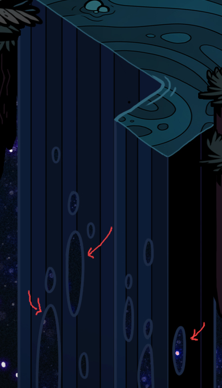
These cutout circles get larger as the waterfall goes further and further down. They simulate the water particles losing cohesion and breaking apart as the force of gravity interacts with them.
To generate these circular holes, I use a voronoi noise texture. Essentially, the noise is a heightmap with circular hills:
You can imagine we’re intersecting those hills through the surface of the waterfall at a slant; near the top of the waterfall, the noise and the waterfall do not intersect, but as the water travels downward, the circular hills intersect more and more of the waterfall. Where the waterfall intersects with the hills, I clip the fragment.
To achieve the effect where the circles become larger near the bottom, I stretch the texture in shader more and more as Y becomes negative using a pow function. (This was really difficult to figure out how to visualize, so no picture for this.)
Finally, I draw outlines around those cutout circles the same way we draw the isolines, only we sample from the voronoi map instead and use the cutout circle threshold value at each fragment.
Conclusion
That’s it! With all of these elements combined, we get our final result.